
Recent Posts


TGIF! :-) The Callie...
A little old with a little new...this set has been letterpress printed twice before in slightly different ways. The "Callie" now makes its way to our beautiful flat-printed invitation line...


Online Store Preview: Falon Boarding Pass
Merry Christmas everyone! Hope you are all having a splendid day.
Maybe I am wishing to be in a warm tropical location in choosing Falon's "boarding pass" save the dates. This set was really fun to design - it comes all tucked into a fun pocket with a tropical pattern - we have 7 other tropical patterns and colors to have fun with and a whole host of other fun papers.

Maybe I am wishing to be in a warm tropical location in choosing Falon's "boarding pass" save the dates. This set was really fun to design - it comes all tucked into a fun pocket with a tropical pattern - we have 7 other tropical patterns and colors to have fun with and a whole host of other fun papers.

Britten Letterpress
blind hit of peony flower with steel blue script
I will *never* forget when Sarah (Britten) and her mother came to pick up her invitations. It was perhaps one of the best days of my journey in invitation design thus far - I am sure you can imagine it just by seeing the beauty of the invitation. It truly brings chills remembering that day. Thank you, Sarah, for allowing me to be a part of it all...

Introducing..."Summer"
Summer - from the paperwhites collection

One of my favorites of the new line - would look amazing in any color. Shown here in geisha red with rain envelopes - Enjoy!
To launch our new line...a new post every day until the New Year!
To launch our new line of invitation designs...I will be posting a new post everyday until January 1st along with a photograph of some of our new invitations! Would love to hear feedback from anyone about the new designs and I may throw a few classics in there too...but lots of eye candy coming! Stay tuned.
What color was your prom dress?
So, it is funny as I start to finalize new designs for our new line of invitations launching New Years Day...it got me to thinking about color and how certain colors seem to repeat themselves for us girls. I may have to restrain myself when it comes to pink!
My prom dress was an icey pink color, jessica mclintock - I LOVE IT!
I worked very hard at my teenage fast food job (Chez' Hardays - aka Hardees) to afford to buy it back then! My mom brought it with her a few years ago on a visit. Maybe I should do a "trash the prom dress" photo! If I recall I couldn't quite get it zipped up, but who knows...the funny thing is I am still drawn to pink. Pink Pink Pink!
Blast from the past...with some cropping to protect the innocent...


Andrea on the other hand, is majorly into black and white and red. She was telling me the other week that HER prom dress was of course, black and white - no surprise! Of course, her wedding day also was full of black and white with a hint of red...
Maybe I will share with you my prom photos, maybe with some help from photoshop! Or I can throw my dress out and photograph it for you...stay tuned. :-)
But in the meantime, what color was YOUR prom dress and are you still "into" that color??
It would make my day to hear all about other prom dress colors and experiences!
Christmas Card 2008
Alas, my Christmas card is ready for mailing and I just had to share it! This year I had the amazingly talented silhouette artist, Karl Johnson (cutarts.com), cut the kids' silhouettes at the NC State Fair. I was able to scan and digitally trace the actual silhouettes so now they can be scaled with ease. I put them on our Christmas Card this year. It is printed on Stardream Crystal card stock in black ink - paired with a red envelope. I just LOVE LOVE LOVE silhouettes. I hope to do more with them in 2009. :-)


Color Trends for 2009
I started thinking about what will next year's "it" colors be. It seemed like this year it was hot pink, gold, eggplant purple, iris blue, kelly green and celedon. So that got me thinking about colors in general and how I feel about them.
Just the other day I told Andrea that the color of the "peach" and "apricot" crayons from Crayola should be outlawed as wedding colors. We all have enough trauma trying to color our family as a kid with those awful crayon colors. It just never did look right. So, my friends...crayola peach and apricot are so OUT this year for weddings!
JustSay NO to 
*as an aside, crayola now makes a set of multicultural crayons to color all the people of the world properly, thank you very much!
Let's talk about what's "IN" - what those new "IT" colors are...
The earth tones are here - mauves (think 80s), grays, greens - but not apple green, more the tone of our paperwhites "cryophase" color and olive greens. Bye bye to chocolate brown and hello "earthy" browns. These browns have more depth and feel very organic.
We will see more "dusty" tones to our lavendars, taupes, peaches and blues, greens, tans, grays and pinks. Just make it dusty and you'll be in style.
And of course, some of the brights still rule, like kumquat oranges, lemon yellow and fushia pinks.
What looks to be "out" (purely Sarah's opinions)???
Tiffany Blue, Chocolate Brown, Lime Green, Teals, Mustard Yellow, Bubblegum Pink (and I LOVE bubblegum pink - but its not dusty)...
Here are a few "hot" color combo picks for 2009 (purely Sarah's opinions)...
Plum and Copper
Plum and Pale Gray
Mauve and Taupe
Fushia and Taupe
Palace Blue and Citron
Kelly Green and Aqua
Kelly Green and Navy Blue
Lavendar (Wisteria) and Gray
Lucite Green and Gray
Earthy Brown and Olive or Celedon
What are your ideas, my humble readers (all two or three of you...)??
Just the other day I told Andrea that the color of the "peach" and "apricot" crayons from Crayola should be outlawed as wedding colors. We all have enough trauma trying to color our family as a kid with those awful crayon colors. It just never did look right. So, my friends...crayola peach and apricot are so OUT this year for weddings!

*as an aside, crayola now makes a set of multicultural crayons to color all the people of the world properly, thank you very much!
Let's talk about what's "IN" - what those new "IT" colors are...
The earth tones are here - mauves (think 80s), grays, greens - but not apple green, more the tone of our paperwhites "cryophase" color and olive greens. Bye bye to chocolate brown and hello "earthy" browns. These browns have more depth and feel very organic.
We will see more "dusty" tones to our lavendars, taupes, peaches and blues, greens, tans, grays and pinks. Just make it dusty and you'll be in style.
And of course, some of the brights still rule, like kumquat oranges, lemon yellow and fushia pinks.
What looks to be "out" (purely Sarah's opinions)???
Tiffany Blue, Chocolate Brown, Lime Green, Teals, Mustard Yellow, Bubblegum Pink (and I LOVE bubblegum pink - but its not dusty)...
Here are a few "hot" color combo picks for 2009 (purely Sarah's opinions)...
Plum and Copper
Plum and Pale Gray
Mauve and Taupe
Fushia and Taupe
Palace Blue and Citron
Kelly Green and Aqua
Kelly Green and Navy Blue
Lavendar (Wisteria) and Gray
Lucite Green and Gray
Earthy Brown and Olive or Celedon
What are your ideas, my humble readers (all two or three of you...)??
Jessica & Anthony 10 04 08
Jessica is a stunning bride - photos from this wedding are just total eye candy! It looks like the wedding day was a spectacular affair. Thanks to Kevin Milz Photography for use of the wedding day photos (he didn't take the invitation ones, that was me - as if its not obvious - LOL). We designed a monogram for Jessica & Anthony and I am just as giddy as can be seeing it projected on the floor.


I also love seeing the scrollwork from the invitation on the cake! How amazing...


Some invitation details...


I also love seeing the scrollwork from the invitation on the cake! How amazing...


Some invitation details...

Jennifer & Chris 10 12 08
I just ran across these photos from Jennifer and Chris's wedding on October 12th. Jennifer ordered our "adria" wedding invitation and it was backed in black linen and assembled in an ivory linen pocketfold. It looks like the wedding was beautiful.


exciting news: grace ormonde wedding style

We are so proud to announce we were selected as a platinum vendor for grace ormonde wedding style magazine for 2009. This is such an honor and we are so humbled to be on this exclusive "invitation only" list of top wedding vendors all over the country. Next time you are in Barnes and Noble, pick up a copy of grace ormonde wedding style. It is a total feast for the eyes!
Their website is totally hot too, wedding style magazine. In the coming weeks, we will have our listing and photographs up on the website as well, so check it out when you get a minute. Yay! Pinch me.
Silhouette Invitation

With the state fair just around the corner, I thought I would post about Kyra and Robert's awesome silhouette invitation for their upcoming wedding. At last year's NC state fair, renowned silhouette artist, Karl Johnson - cutarts.com was cutting silhouettes. We were able to scan and digitally trace their silhouette cut outs and put them on their wedding invitation and seating cards. The results were awesome, classic black and white paired with a tiffany blue envelope. Karl is quite amazing and has been featured in Martha Stewart Weddings among others. We cannot wait to do another silhouette invitation again!
Check out a VIDEO of Karl cutting a silhouette LIVE!
UPDATE: Yay! Karl will be at the NC State Fair again this year from October 16-26th (look for him in the village of yesteryear).
Katrina & Brandon 9 13 08

Katrina is no ordinary bride and was a joy to work with. I am so happy to post some photos from her wedding day. The amazing photographs are by adam barnes fine art photography in Lynchburg, VA. The wedding and reception took place in Williamsburg, Virginia in the Sir Christopher Wren Chapel on the campus of the College of William and Mary. Katrina wore a blush pink dress with a bubble skirt...need I say more? Her invitation was our pink peony, better known as "peony love" with rich chocolate type and pink envelopes to match - the peony design was also on her wedding day programs. We wish you all the best Katrina and Brandon.


Oh Charleston!
So I am trying to give anyone reading our blog - is anyone out there (we LOVE comments) a better snapshot into what we do everyday. August is a bit slower for us so I have actually had some time to breathe this past week. I have been spending way more time reading other blogs and trend-shopping then I should be, but I digress. I wanted to share some photos of a set we did for a delightful bride, Sara. I could tell Sara had an artistic side upon meeting her the first time. She has a great sense of style. At any rate, she is getting married in Charleston this fall and is using a rich palette and we had the task of coming up with a design just for her. What follows is our heavy ivory stock, printed with a matte metallic coppery/gold ink. The backer card is a deep purple (which is hard to see in the shot). This purple is just gorgeous. The envelopes are a metallic rich, champagne/gold color.

Before and After
We loved meeting everyone at the show! This is the first of the long awaited before and after shots of the new digs.


Pushing the Envelope & Naming the Blog

One of the things I love *most* about letterpress is the design work I can put on envelopes. So to follow, are some of the latest envelope designs. We have been tossing around lots of ideas for the naming of this blog - hoping to kick it up a notch as time allows. And, it got me to thinking that "pushing the envelope" is what paperwhites press is all about. I started this little company wanting to bring a touch of big city style to the south, so in essence we are "pushing the envelope" everyday.


See you at the show!
Hope to see some of you at the Wedding show next Sunday August 17th at the fairground from 12-5. We will be there with bells on or something like that. Seriously, we will have some pretty nifty new invitations that have come off the press lately! We always enjoy hearing about weddings, colors, themes and ideas that our brides have, so if you are there - stop by and say hi!
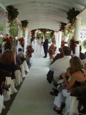
Sarah + Kevin : July 12th

I had the pleasure of doing the invitations for Sarah and Kevin and also attending as a guest. It was a beautiful affair. Interesting note, on the invitation - it was worded "a fine affair to follow" and fine it was!
My friend Andrew Bryant captured the magic as the photographer! Read about it on his blog
Sarah is such a warm and special person. When I was asked at the wedding how I knew the couple, I told them I designed the wedding invitations. The response was - "they were so Sarah."
So what did the invitations look like? They were 7x7 squares, letterpress printed with a blind hit of a peony flower, meaning there was no ink laid into the paper. The type was done in a soft steely gray-blue script.
The wedding was at Sarah & Kevin's home and even the paint on her walls was that steely blue color! When I walked into her home, which is decorated with such amazing taste, I could put all the pieces together and smiled and thought, they are so Sarah.
I hope to post some invite photos of Sarah's set here very soon, but for now enjoy the digital file.
NYC was AWESOME!
The stationery show rocked. I came home tired and worn and then went to the Duran Duran concert last night and remember why I love Duran Duran so much. They are still so good after so many years. It was just a great show - the icing on the cake of a fantastic trip to NYC.
While in NYC, aside from the show we did the following.
1. Rode the tourist bus all over.
2. Top of Empire State Bldg.
3. Ate John's Pizza and Junior's Cheesecake.
4. Went to M&M World.
5. Shopped Century 21.
6. Saw Ground Zero.
7. Went into Trinity Church.
8. Walked all over Times Square.
9. Rode the Subway.
10. Rode the Staten Island Ferry.
11. Walked through Bryant Park (near the hotel).
12. Had a death-defying cab ride or two.
Can't wait to do it all again.
Ideas for Your Wedding
I LOVE the gallery on Fresh Affairs website (especially b/c yours truly created it) :-), but seriously, I just marvel at the incredible work that Lyn and Michael do. I marvel at the amazing photography. I still LOVE to design and create websites, especially with such beautiful images. Check it out to get some great design ideas for your own wedding. It is pure inspiration.
I will be adding to it often for Lyn, so check it out on occasion to see what is new!
FRESH AFFAIRS GALLERY HERE
I will be adding to it often for Lyn, so check it out on occasion to see what is new!
FRESH AFFAIRS GALLERY HERE
Photos from Cary Magazine Wedding Show


Here are some photos I took in March at the Elegant Weddings Gala at Prestonwood - the lighting wasn't too great - wishing I had taken these using camera raw, but I am not much of a photographer either! :-)
Contemporary Vineyard Wedding

This is an invitation proof that has been mocked up for one of my brides, LeAnne. It is a contemporary take on a vineyard wedding. This will be printed on a white paper and layered with a celedon and darker mossy green card. It is going to be really neat! I sympathize with brides who have an idea like wanting grapes, but don't want their invitations to look too much like clip art or cheesy.
Daisy Notes and Paper
I had the pleasure of meeting Sheryl Blackwell from Daisy Notes and Paper in Durham prior to vacation. She is a connoisseur of fine paper so we really hit it off right away! She carries some wonderful papers and letterpress goods and stationery in her shop - Daisy Notes and Paper.
If you are ever in the Southpoint area of Durham, check her out!
If you are ever in the Southpoint area of Durham, check her out!

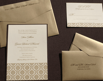
Charcoal Gray and Silver, the perfect combination

Charcoal Gray and Silver A9 Invitation on Crane's Lettra Pearl White, Reply with Letterpress-printed envelope and letterpressed stardream silver bellyband hand addressed to guest

letterpressed gray ink on stardream silver envelope

envelope front hand addressed

careful use of type

Daisy Fun!

We mocked up a really cool daisy for Katie, one of our brides. We decided to go a different direction with her set, but I just LOVE it b/c it was hand-drawn by Callie and scanned and it is just really sweet. Will have to post things from her set as well!!!
Enjoy!
Custom Letterpress Notecards are in!


We have our first samples of our new line of custom letterpressed notecards. These make a great gift for the bridal party, special friends or loved ones...or that paper snob you know! I literally happy danced when I opened the box, all over the kitchen - my husband looking at me like I am nuts!
We have samples if you would like to see for yourself just how special these are, just ask. The price will be $155 for a set of 45 cards with colored envelopes.
2008 The Year of the Peony....among other things

So, I have officially dubbed 2008 as the year of the peony and I love it! Maybe I'll do a "year of" every year or just talk about trends in general. Peonies are trendy! It is no wonder as they are such a beautiful romantic flower. So, with that said, I'm going to post some recent peony creations. I am adding the 2008 invitations into the mix also in the coming weeks. Look for lots of new invitation sets.
Trends: peonies, anything green and brown, purple and charcoal gray, yellow and brown, earthtones, "green" (for the environment) invitations.